...
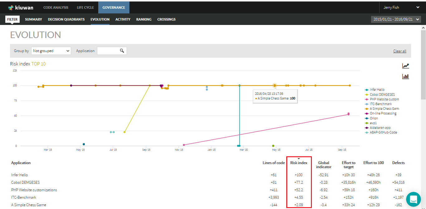
Evolution page shows how applications evolve in a metric or indicator during a certain period of time.
As an example, below image shows evolution of Risk Index during the specified time range.
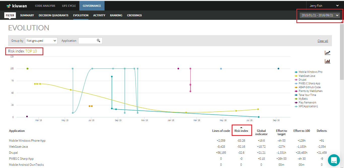
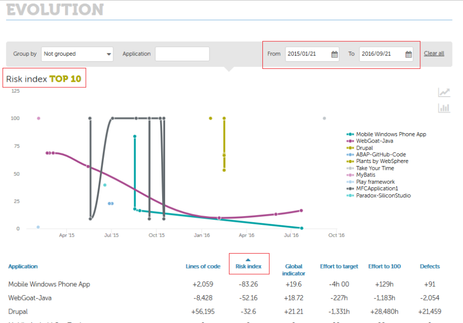
The lines graphic shows the evolution of the absolute value of the metric (Risk index in the example) during the selected period of time.
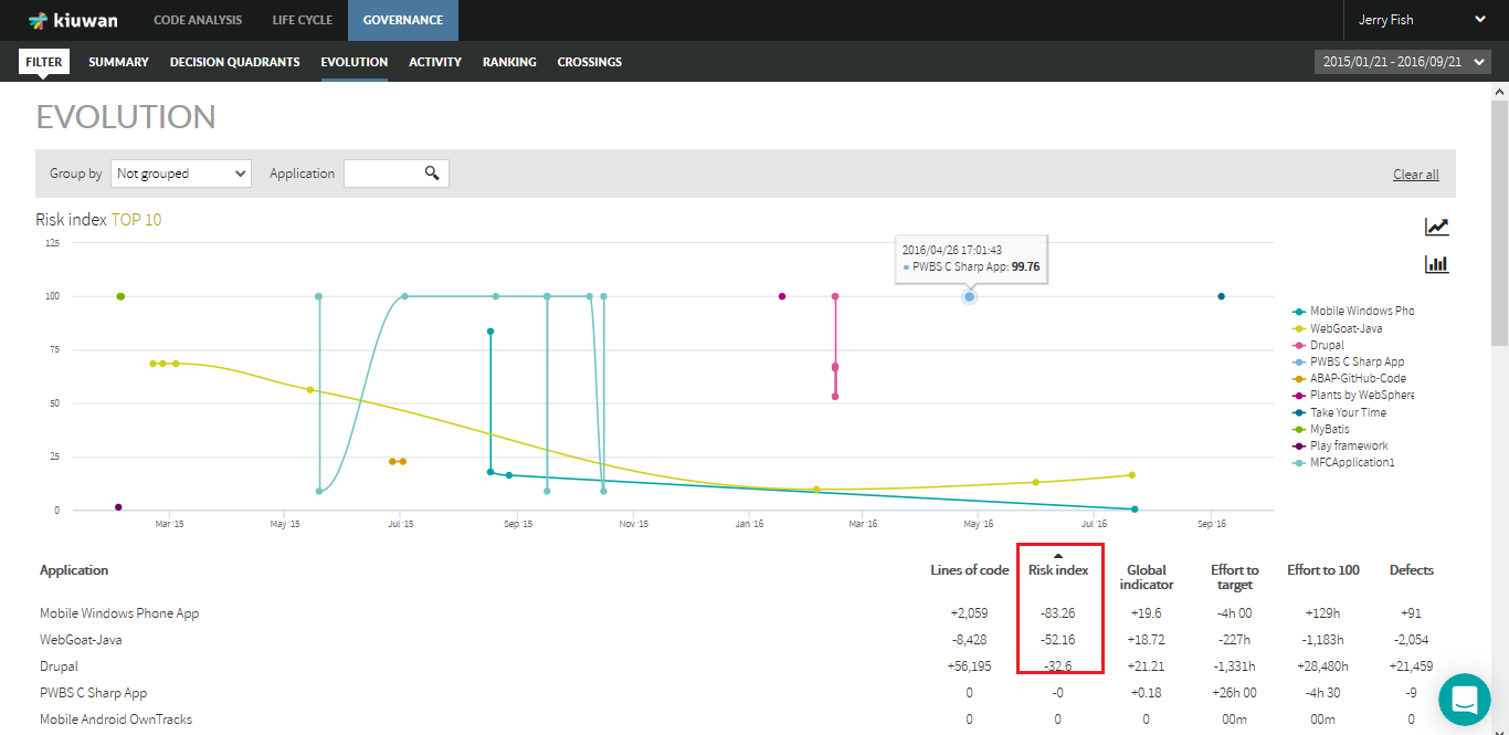
Hovering the mouse over the graphic lines will show details on values for every app analysis. Clicking on the name of an application will hide that application from the lines graphic.
You can select the metric clicking on the column name with the desired metric.
Once you selected a metric, the lines graphic will be automatically recalculated for the seleced metric.
Lines graphic does not display all the application, but only those top-10 apps with the highest variation in the selected metric during that period of time. That variation can be positive or negative depending on the order applied to the selected metrics.
The tabular list, however, shows the variation of the different metrics for every application during the selected period of time
In this example, we can see that during this period of time the app Mobile Windows Phone App increased its size in 2,059 lines of code, it reduced its risk index in 83.26 points, its global indicator has augmented in 19.6 points, etc.
The tabular list shows all the applications analyzed during the selected period of time.
...
The list of applications can be sorted in ascending or descending order. Click on the selected column to switch between ascending/descending order.
Let's see how it works with an example.
If you select ascending order (up arrow in the column name) for Risk Index, applications will be sorted from higher reduction in risk index to lower reduction. In the example, Mobile Windows Phone application is that more reduced its risk index, being WebGoat-Java the next, and so on.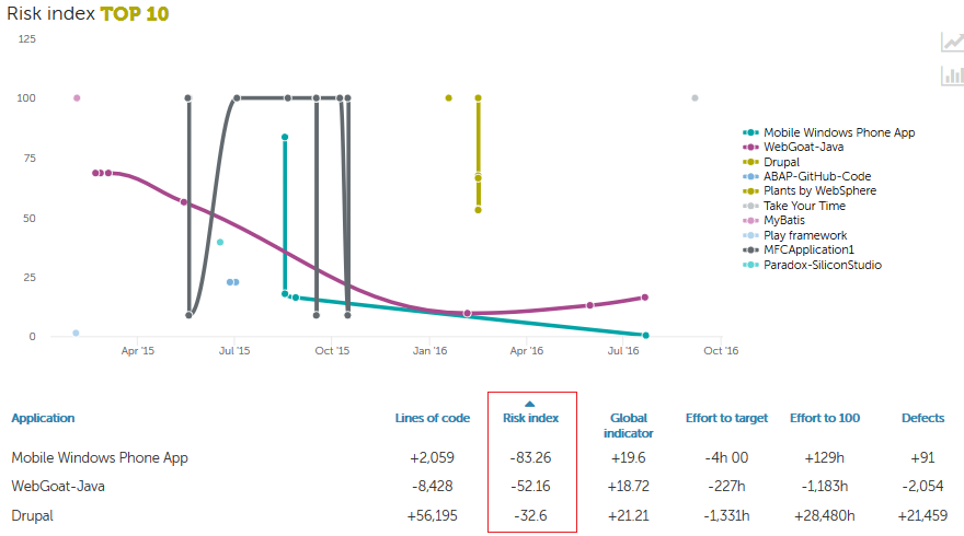
However, if you change to descending order, Infer Hello app will be the app that more increased its risk index during that time.
| Info |
|---|
Note: If you change the order, the lines graphic will change accordingly to display the top-10 applications. |
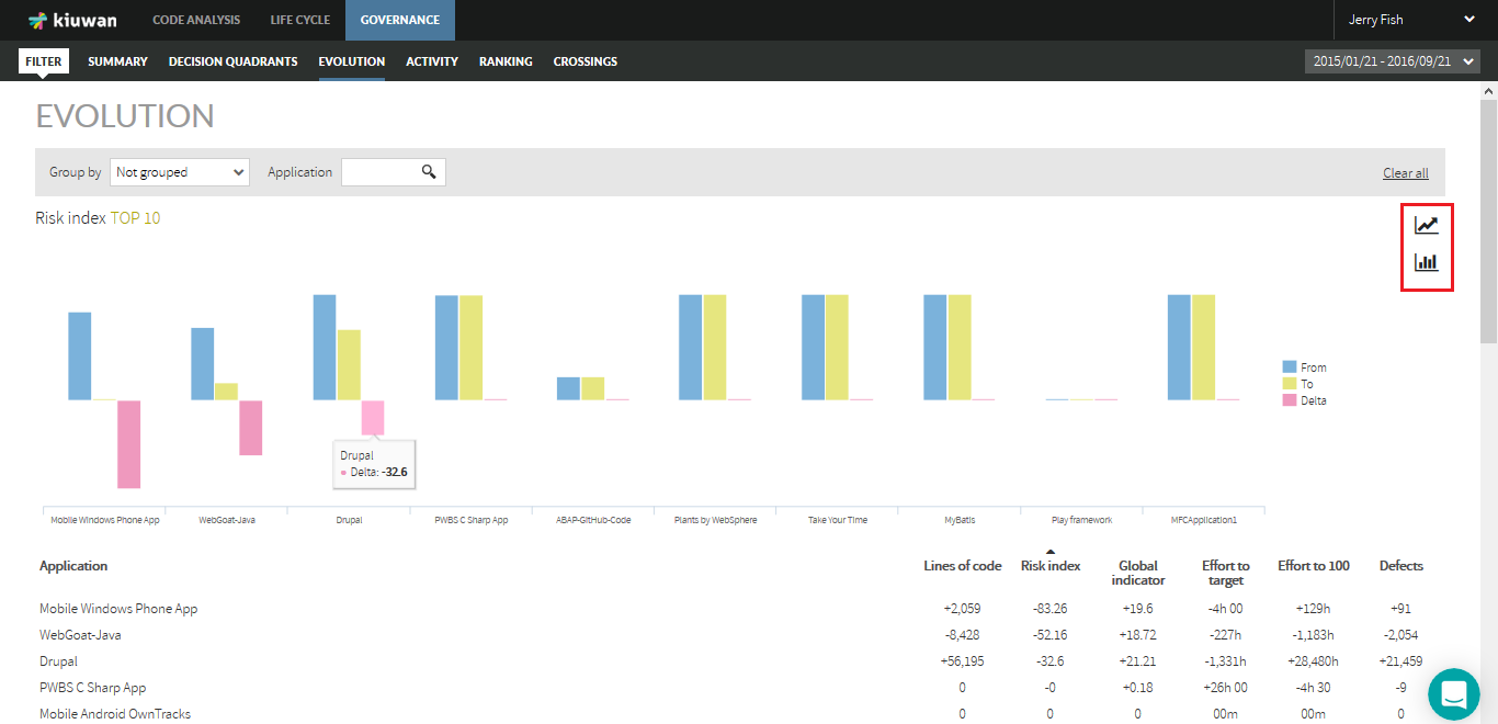
As above mentioned, lines graphic shows the evolution of the metric during the period of time, displaying the evolution during that period of time.
If you are only interested in the initial/ending values and the variation (delta) between them, you can change the lines graphic to a bar graphic clicking on bar graphic icon.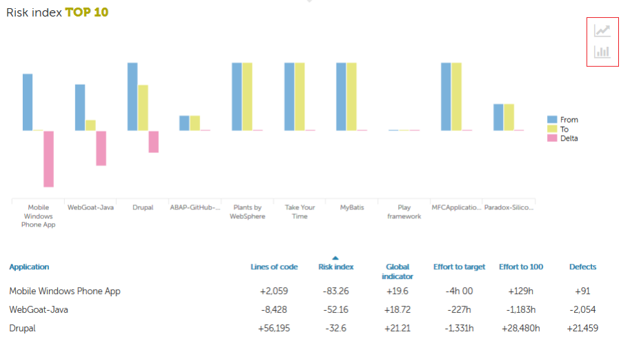
Portfolio Evolution
Besides of applications, Kiuwan also allows to display evolution of portfolios using the "Group by" combo.
For example, all applications are assigned to a Provider. Then, by selecting "Provider" you can see the evolution of that provider in the selected metric during that period of time.
Next image shows the evolution in Risk Index of the providers, being Mels Factory the provider with higher reduction in risk during this period of time.
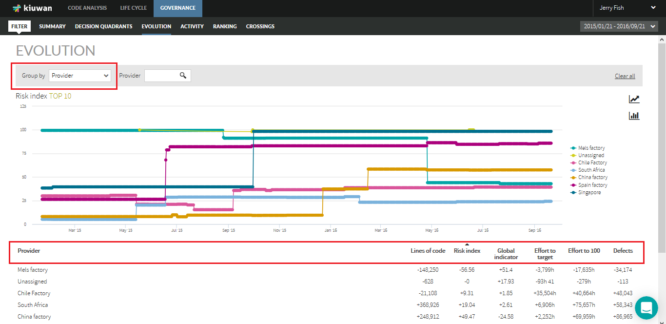
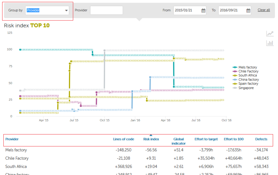
Same as in "application" view, you can switch between ascending and descending order. Also, you decide whether show all points of the selected period (lines graphic) or only initial/end points and delta between them (bar graphic).