Versions Compared

Key

  • This line was added.
  • This line was removed.
  • Formatting was changed.

This page will explain the Activity section in Kiuwan Governance. 

Contents

Table of Contents

The activity page displays the applications'

Table of Contents

...

activity data.

...

On this page, you can control and manage the activity of all your software providers, development teams, different applications technologies, etc.

...

You can filter the activity by any of the groups of portfolios you have in your account.

...

Select a time period you can access

...

all the information for that period

...

: lines of code analyzed, risks, global indicators, effort to target…

The information displayed indicates the variation of that item within the selected period

...

.

This page organizes information in two basic views:

  • Applications (information related to changes in metrics and indexes)
  • Deliveries (information related to applications life cycle)

Both views allow

...

displaying application activity grouped by portfolios. To access these sections, open the drop-down menu on the left of the main page title. 
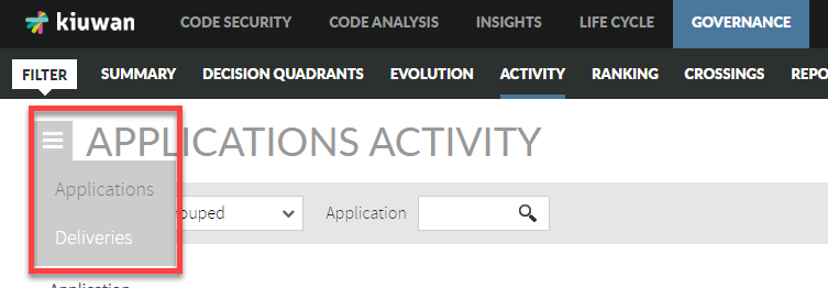
Image Added

Applications

Application Activity

Application Activity page allows

...

viewing changes of applications (activity) on a selected metric or indicator during a certain time period

...

.

...

Changes in activity can be viewed for a specific application or for those applications that

...

belong to a selected portfolio.

...

The application panel shows changes in the following metrics/indicators:

  • Lines of code
  • Risk index
  • Global indicator
  • Effort to target (as defined in the model of the application)
  • Accumulated effort
  • Number of Defects

 
As an example, the below image shows changes

...

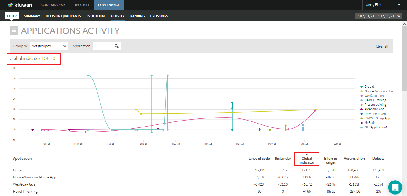
in the Global Indicator during the specified time range.

Image Modified

...


While the Evolution page

...

shows the absolute values of the metric, the Activity page shows the variation of the metric value since the beginning of the selected period.

For better understanding,

...

the following table shows an example :


Y-Axis values (e.g. Global Indicator)


...


...


Panel

Date-1

Date-2

Date-3

Evolution

59.20

47.84

66.04

Activity

0

-11.37

6.84


...

Browsing the Activity page for applications is

...

done in the same way as in the Evolution page for applications, so please visit the Evolution panel documentation page

...

 to learn more about it.

...

Activity of Applications Grouped By Portfolio

...

Use the

...

Group by

...

drop-down menu in the Activity page to displays the activity of applications grouped by Portfolio values.

...


Select a specific Provider to see the activity of applications grouped by this provider's values during that period

...

.

...

Click on the row of a provider

...

to show active applications (i.e. applications that have changed) during the selected period.

Image Modified

Info

IMPORTANT: If an application changes from one portfolio value to another during the selected period, that application will appear several times, once per portfolio value to which it has belonged

...

. This might be the case, for example, if during the selected period the application had changed

...

from the provider. In that case, that application will appear once per provider.

...


The next image shows an example.

...

Image Modified

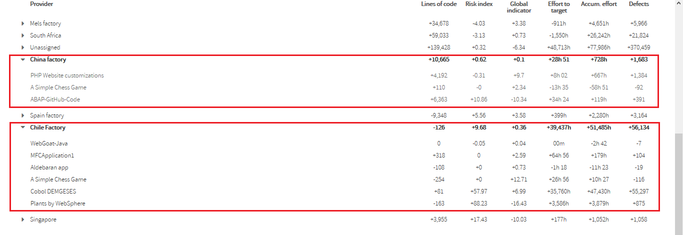
In this example, "A Simple Chess Game" application appears twice because during this period it was maintained by two different providers, "Chile Factory" and "China Factory". It reduced its size by 110

...

LOC while it was maintained by Chile Factory and by 34

...

LOC while maintained by China Factory.

Deliveries

The Deliveries panel displays data on applications/portfolios from a Life Cycle perspective (number of baseline/deliveries, dates, results, etc).

...

Refer to the Deliveries

...

 doc page for

...

more information on Deliveries management.

Image Modified

 
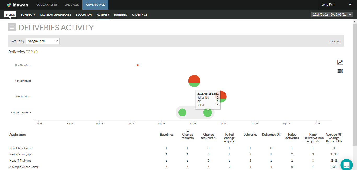
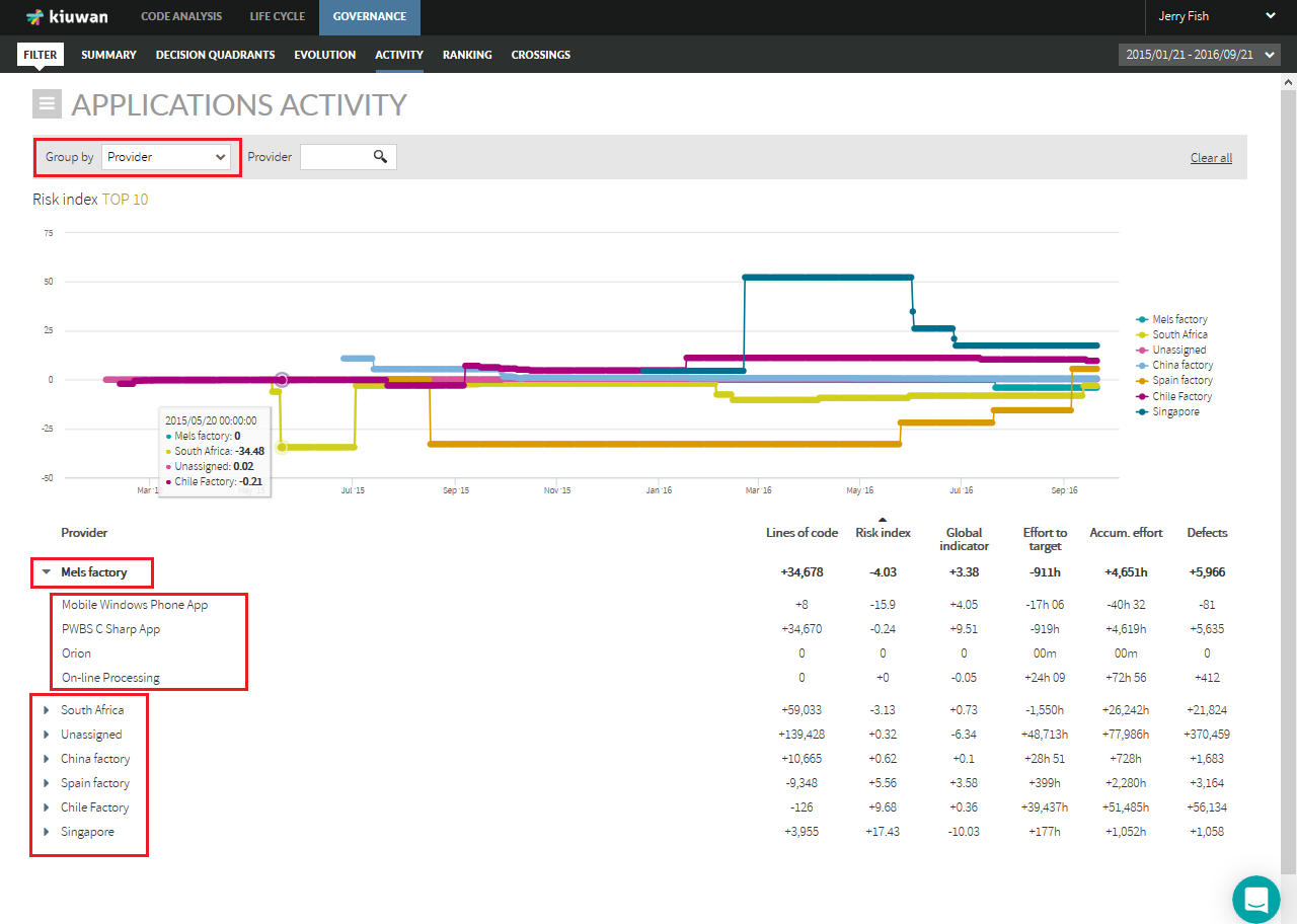
If not grouped, the displayed data will

...

refer to the applications.

...

The Group by

...

menu allows to group applications by the selected portfolio group, so data will be presented for portfolio values.

In the Deliveries graphic, there are two kinds of icons:

  • A square: a single Delivery analysis
  • A circle: a grouping of Deliveries


Info

The graphic will present a circle when there are deliveries very close in time according to the time scale of the graphic.

...

Click on a circle

...

to open a new diagram that shows the deliveries included in the group (zoom-in).

If the inner diagram still shows circles, you can zoom-in recursively. To return to the previous view, click on the lens icon (top-right side of the graphic).


In the case of a group (a circle), the size of the icon is proportional to the number of deliveries.

...

The color of the icon is green or red depending on the audit results of the deliveries, being green if

...

OK and red if Failed. As a circle is a group of deliveries, a mix of green and red indicates that in that group there are deliveries OK and Failed.

...

Hover the mouse over the icon

...

to show details on that delivery/group.

For a delivery (square) it will show:

  • date of the delivery analysis
  • the label of the baseline
  • score and number of files of the delivery

For a group (circle) it will show:

  • total number of deliveries
  • number of deliveries OK
  • number of deliveries FAIL


...

Click on the

...

corresponding icon

...

to switch to a line

...

graph where the total number of deliveries is displayed for every application on a timely basis.
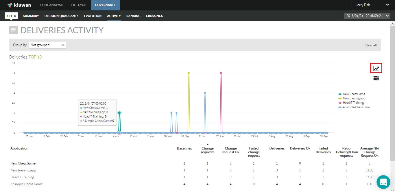
Image Modified

 
Tabular List
 
Within the selected

...

period,

...

a list displays the following information for every application:

  • Baselines:

...

  • Number of baselines analyzed
  • Change Requests:

...

  • Number of change requests analyzed  
  • Change Requests OK: Number of change requests whose last analysis was

...

  • OK, i.e. the audit result was OK
  • Failed change request:

...

  • Number of change requests whose last analysis was failed, i.e. the audit results

...

  • were FAIL
  • Deliveries: Total number of deliveries
  • Deliveries OK:

...

  • Total number of deliveries whose Audit was OK.
  • Failed deliveries:

...

  • Total number of deliveries whose Audit was FAIL.
  • Ratio Delivery/Change Requests:

...

  • Average of deliveries by the change request
  • Average (%) Change Request OK

...

  • : Average percentage of change requests that were OK.