...
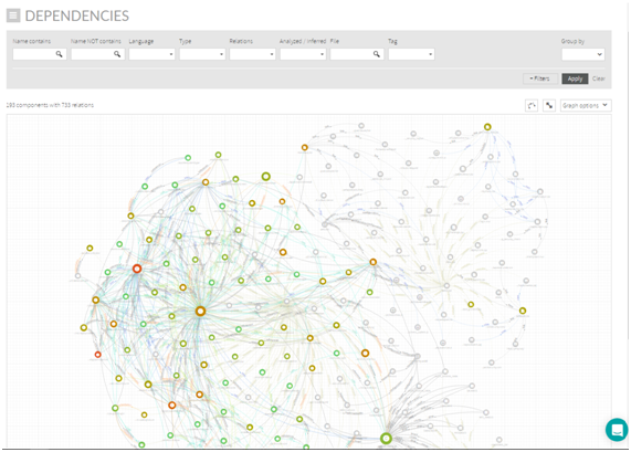
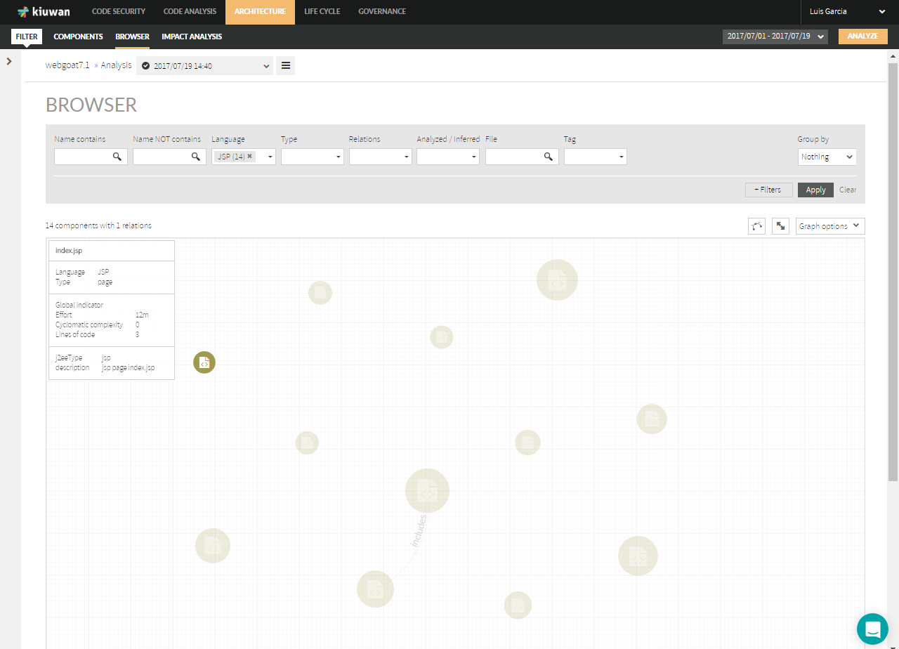
Browser page displays a graphical browser of components and relationships among them.
| Info |
|---|
Please note that, depending on the size of you app, the number of components and relationships may be very large. That’s why Browser page displays a section to filter the resulting components and relationships that will be drawn. |
...
This page is split into two sections:
- Search criteria
- Results of search
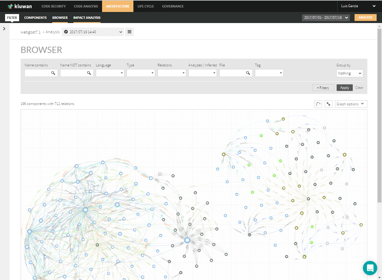
Browser’s search criteria
...
- “Name contains” : components including the typed text as part of the component name
- “Name NOT contains” : components NOT including the typed text as part of the component name
- “Language”: programming language of the component (available values are only those languages found in the application). Language values include the number of components found of that language, e.g. Javascript(7) means that there are 7 Javascript components
- “Type”: component type, i.e. category of the component as labeled by Kiuwan Architecture (available types depend on the technology of the application). Type values include the number of components found of that type, e.g. Class(115) means that there are 115 classes in the model
- “Relations”: relationship type, i.e. category of the relationships as labeled by Kiuwan Architecture (available types depend on the nature of the application). Relations values include the number of relations found of that type, e.g. Inherits(36) means that there are 35 inheritance relationships among the components in the model
- “Analyzed / Inferred” : a component can be “analyzed” (i.e. it has been found during the analysis because the component has a source code file) or “inferred” (i.e. the component is referenced somewhere in the source code but there isn't any source file for it)
- “File” : components including the typed text as part of their source file name (including directories)
- “Tag” : components tagged with the specified tag ( see below “Add tag to component(s) ” )
You can add/remove search filters manually selecting from the “+Filters” list (please read below for special “Tags” filtering).
| Info |
|---|
Resultant search criteria will be the addition (AND’ed) of selected values for the search filters. Some search boxes are multi valued (Language, Type, Analyzed/Inferred and Tag). Specified values for each of them will be OR’ed to the resultant query. NOTE: An exception to this behavior is Relations filter. When you select a value for this field, graphic view will only display that relation, do not filtering the displayed components. |
Graphical view will display individual components and relationship.
...
- Nothing (default value): individual components, no grouping
- Type : displays components grouped by component type (one node for every available component type)
- Language : displays components grouped by language (one node for every available language)
- Custom Tags Groups: displays components grouped by Tag Group (one node for every group tag belonging to the selected custom tag group) Please see Components Tagging for further info.
Browser’s query results
| Info |
|---|
Once you have filled your search criteria, clicking Apply button will display a graphical view of components and relationships matching selected filters. |
...
| Info |
|---|
An exception to this behavior is Relations filter. When you select a value for this field, graphic view will only display that relation, do not filtering the displayed components. |
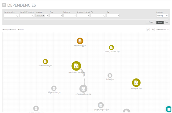
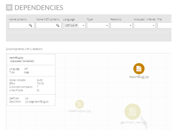
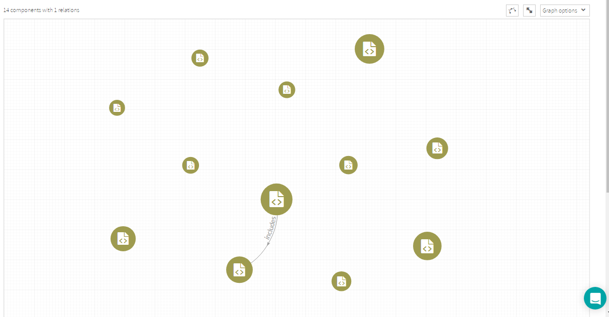
For For example, let’s say that you start filtering JSP components. In our sample app, graphical view will display something like next image.
Graph Options
“Graph options” menu allows to customize some of the graphic display and layout.
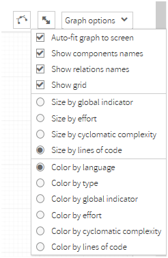
If checked, “Auto-fit graph to screen” option will resize and center the graphic every time it’s redrawn. If not checked, layout will be preserved.
Every component will have a size and color. You can select the “meaning” of those characteristics.
For size, you can select among global indicator, effort, cyclomatic complexity or lines of code (the default value).
The size of the component will be directly proportional to the value of the metric.
Similarly, you can decide the color of the components depending on available metrics (language, type, global indicator, effort, cyclomatic complexity and lines of code).
For metrics with discrete values, different colors will be assigned to each value. For metrics with continuous values, red-yellow-green colors will be applied depending on the “meaning” of the selected metric (red for “bad” values, green for “good” values).
Displaying Component attributes
| Info |
|---|
By hovering the mouse over a component, Kiuwan will display an emerging text box with attributes and data associated to that component. |
Available data depends on the type of the component and vary accordingly.
Besides displaying component’s data, hovering the mouse over a component grays all the nodes/relations not directly related with it, highlighting the node and its direct relationships.
Displaying Component relations
| Info |
|---|
Once you have a view with many components, clicking on a component will display only the selected component and components directly-related with it, i.e. its direct neighbors. |
...
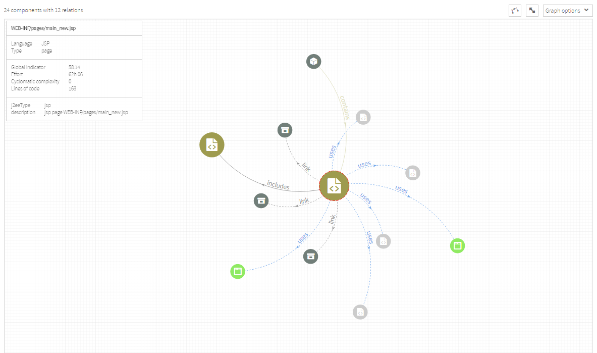
Selected component The selected components will be highlighted by a red circle surrounding it.
| Info |
|---|
Clicking again in on a selected component can be interpreted as “unselecting” it, so the previous graphic will be displayed again (displaying again those nodes hidden when the component was selected because they were not direct neighbors). |
Displaying Component neighbors
| Info |
|---|
“Add neighbors” button will display all the neighbors of the selected component regardless of the filters. |
...
For example, you have filtered components by JSP language, so the graphic will only display JSP components (and their relations).
In our example, there’s only one “includes” relationship among existing JSPs.
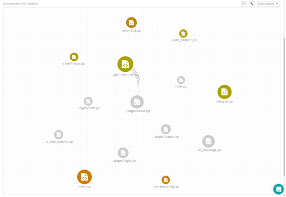
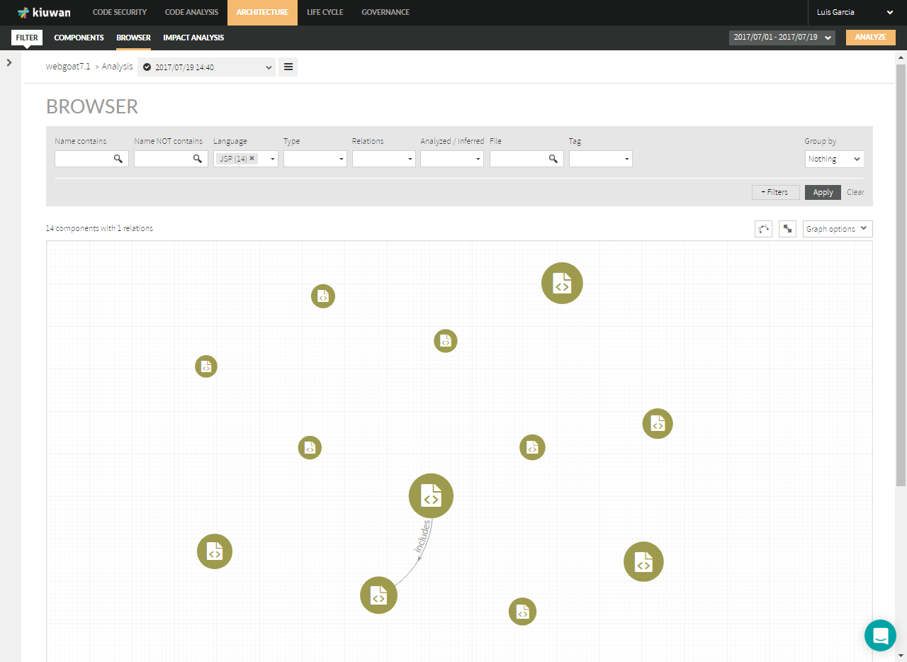
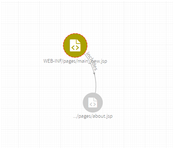
Now, you click (and select) a specific JSP
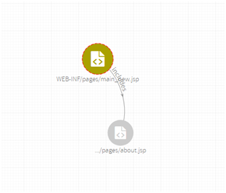
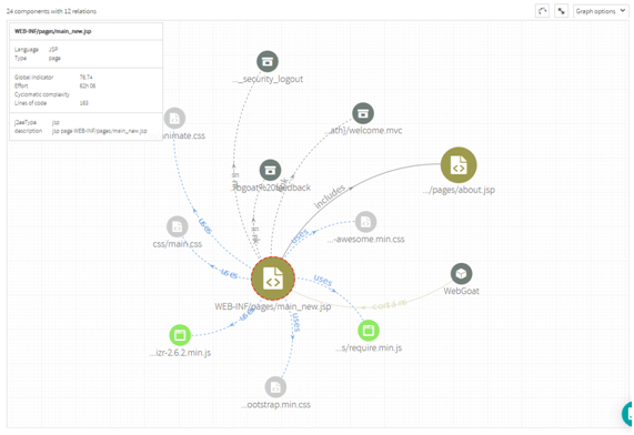
Now, clicking on “Add neighbors”, Kiuwan will display all components directly - related to the selected component, regardless of the language and the type of the relations.
| Info |
|---|
In summary, clicking on “Add neighbors” Kiuwan will create a new graphic where you can recursively apply the above actions:
|
...