...
As an example, below image shows changes of Global Indicator during the specified time range.
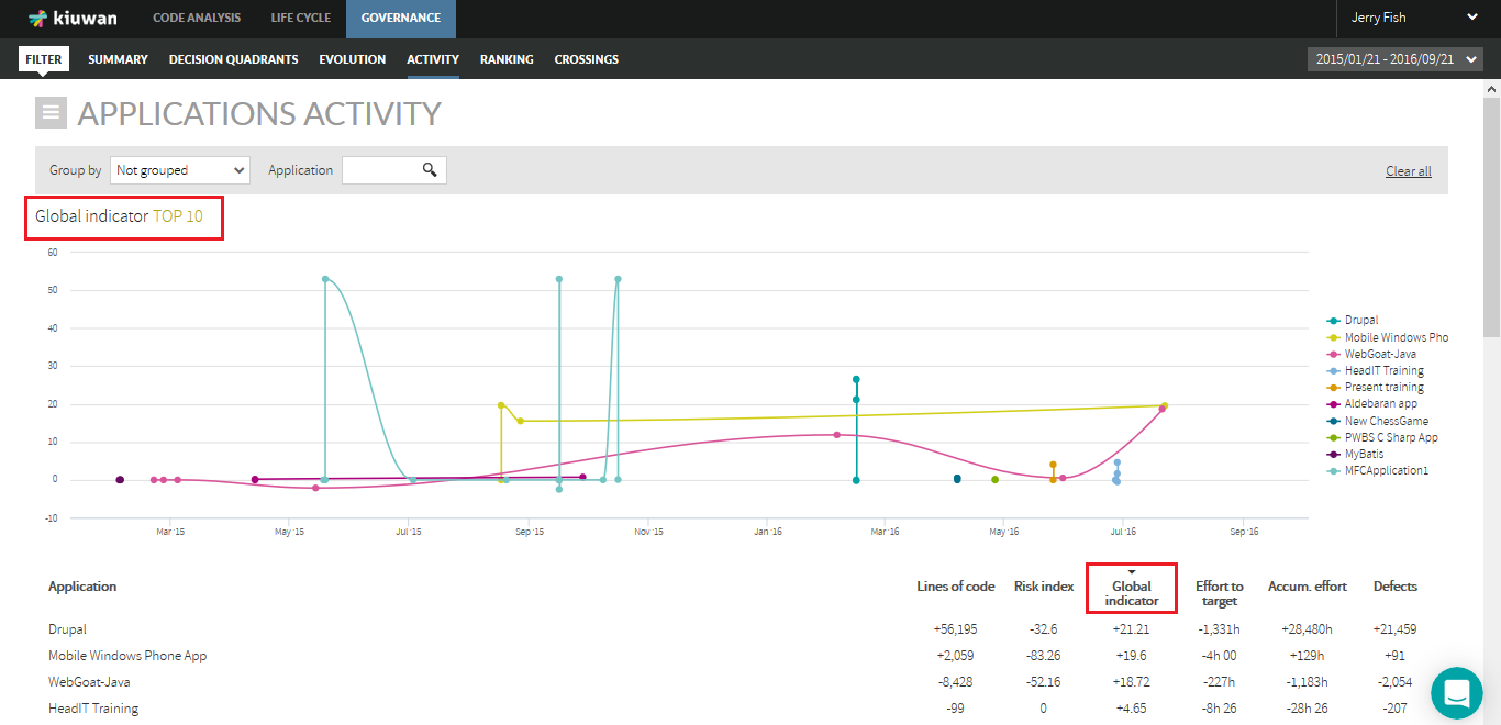
While Evolution page (see Evolution) shows the absolute values of the metric, Activity page shows the variation of the metric value since the beginning of the selected period.
For better understanding, next table shows an example :
...
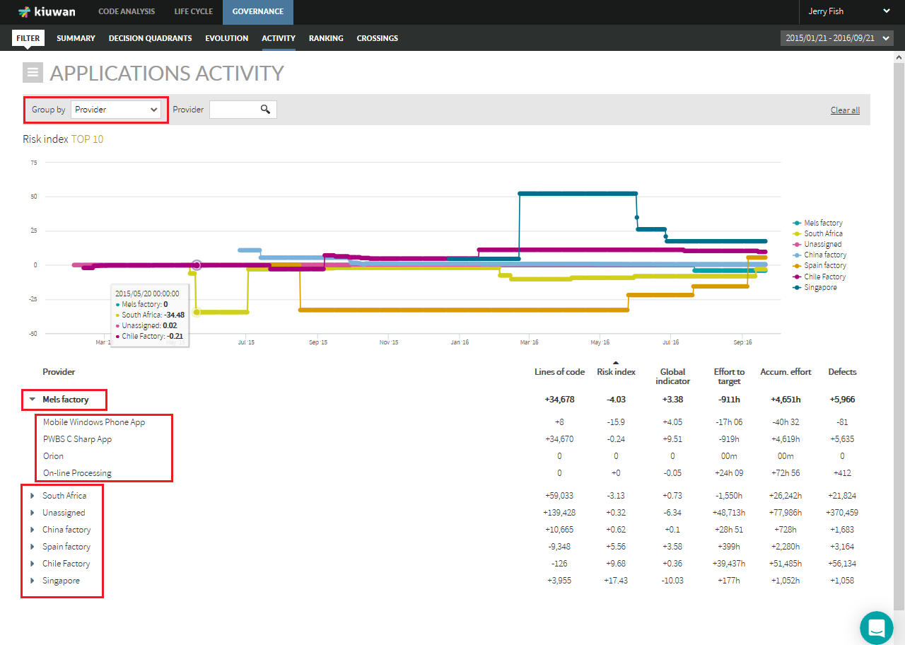
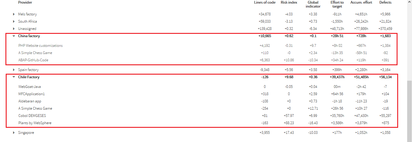
Using the "Group by" combo, Activity page displays activity of applications grouped by Portfolio values.
For example, selecting "Provider" you could see the activity of applications grouped by provider values during that period of time.
Clicking on the row of a provider will show active applications (i.e. applications that have changed) during the selected period.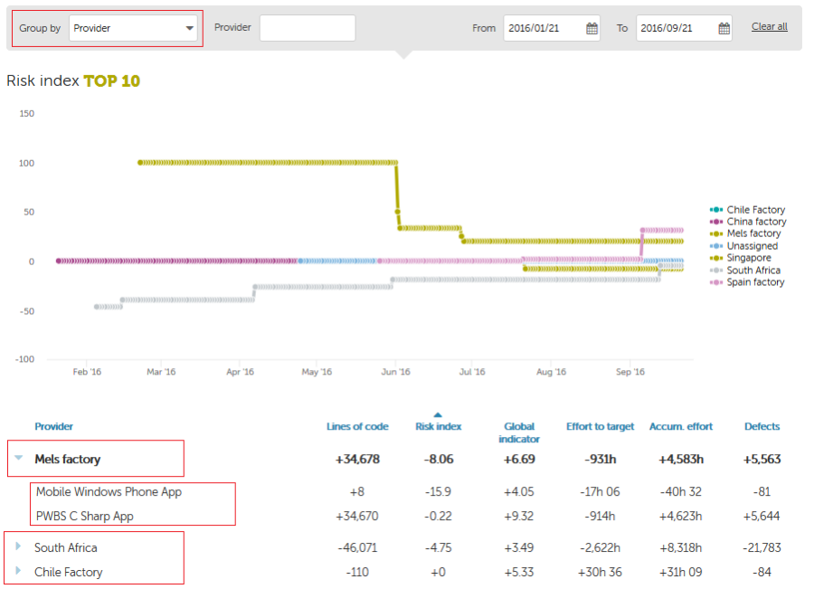
| Info |
|---|
IMPORTANT: If an application changes from one portfolio value to another during the selected period, that application will appear several times, once per portfolio value it has belonged to. This might be the case, for example, if during the selected period the application had changed of provider. In that case, that application will appear once per provider. |
Next image shows an example.
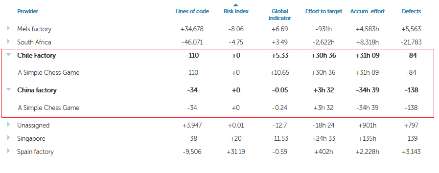
In
In this example, "A Simple Chess Game" application appears twice because during this period was maintained by two different providers, "Chile Factory" and "China Factory". It reduced its size by 110 locs while it was maintained by Chile Factory and by 34 locs while maintained by China Factory.
...
Deliveries panel displays data on applications/portfolios from a Life Cycle perspective (number of baseline/deliveries, dates, results, etc)
Please go to Deliveries view doc page for deliveries.
Deliveries panel can be accessed clicking on Deliveries link in Activity Panel. 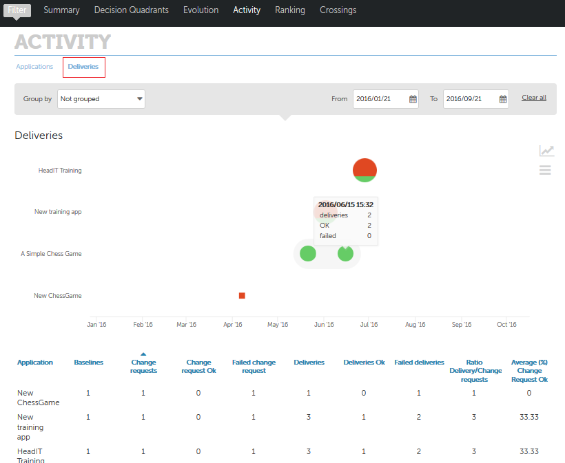
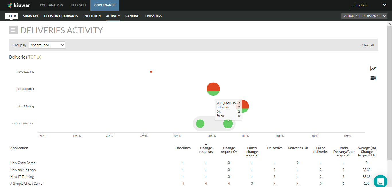
If not grouped, displayed data will be referred to applications. "Group by" combo allows to group applications by the selected portfolio group, so data will be presented for portfolio values.
In the Deliveries graphic, there are two kinds of icons:
...
Clicking on the correspondent icon you can switch to a line graphic where total number of deliveries is displayed for every application on a timely basis. 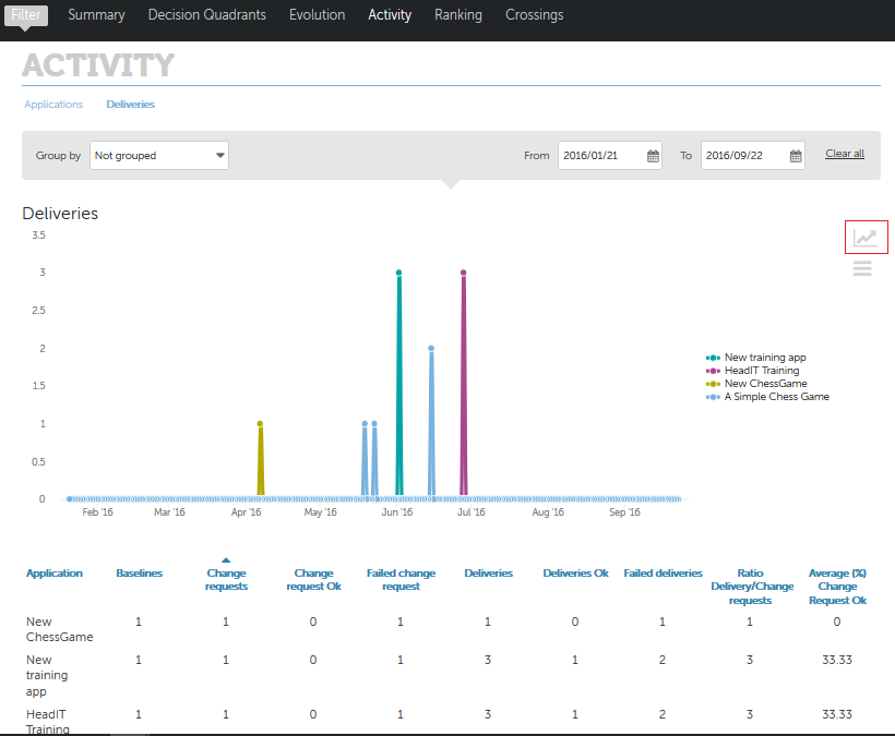
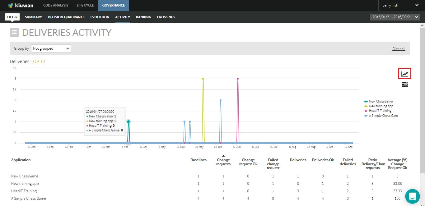
Tabular List
Within the selected time period, tabular list displays the following information for every application:
...